L3 - GROUP 3 (Tom & Liam) Fim Opening Rough Cut from cmdiploma on Vimeo.
Tuesday, 17 November 2009
Evaluation Activity 1

1 (Props) : We used the one main prop, which was the ipod shuffle. We used this for two main reasons. The first was so we could use the soundtrack, and the second was to give the film something the audience could relate to.
2 (setting and location) We decided to set our film in urban areas because Its where most teenagers live/brought up. We chose house that would typically be seen in the city.
3 (camera work and editing) We chose mainly mid and long shots to show the audience the area where the main character lives. We decided then to add titles in the shots around him as there is plenty of space.
4 This is a particular shot we liked because we thought it gives a mood and feeling of loneliness.
5 (main title) We chose this for our title as we thought it sounded good as it is relatable to music. The general idea was to make the title relatable to the character. By adding the mp3 player into the title it gives a the idea and genre of the film.
6 (introducing the character) We decided to open our film showing our character. We did this because we wanted the audience to have a clear understanding of who the main character.
7 (Title font and style) We decided to use simple white text as it would be clear to the viewer.
8 (Genre) This shot shows the audience the film is based around the appreciation of music.
9 (Costume) We chose to dress the main character in clothes teenagers today would wear, we did this so it would be more relatable. We also added a rucksack to show he is preparing or packed something important.
Evaluation Activity 2
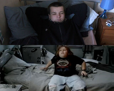
We believe that our character, is most like the main character from Tenacious D And The Pick Of Destiny. Both characters have a strong love for music, but have different ways of showing it. The main character in Tenacious D has an open view on his music, as he shows it through median of song. However our character has a secretive nature never speaking or expressing his views in any way. The similarities are that they both play as the leading role in there films. They both are young and stereotypical of there age groups.
Evaluation Activity 3
This is our voice over for our opening. This was quite a difficult task as we found it hard finding somewhere quiet enough, but we did eventually. When we did, we ended up taking multiple takes just to make sure it was okay.
Evaluation Activity 4
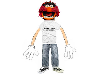
Our Target Audience...
16 years of age
stereotypical male teen
baggy, jeans, baggy shirt, scruffy shoes or converse
lives in an semi-detached house
buys music and films from hmv
he watches films cinema ie. cineworld/vue
listens to rock, indie, ie. i am the movie-motion city soundtrack
listen to music,and plays games in spare time
not a lot of tv watching
films like tenacious d and school of rock
plays games like guitar hero, rock band on Xbox 360
Evaluation Activity 6
Some screengrabs of websites and Programmes.
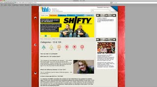

We used the BBFC website to look and see
what rating best suits our film.
Soundcloud was used to put our practice
soundtrack that we made in gargageband on.
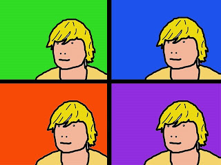
We used photoshop to edit all the pictures we
have made like the 3x3 grid. I have learnt
some very good editing skills in this program.
Vimeo was used to put all of the videos
involved in the project on. For example our
animatic.
Flickr was used to put all of our pictures
involved in the project on. For example our
storyboard and 3x3 grid.
We used the Youtube editor to add annotations
to our opening. We picked a specific time we
wanted an annotation to come on, then put
the length it will be shown.
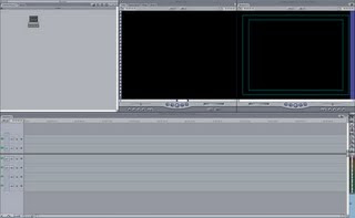
Final cut express is what we used to do all the
fim editing. It is a very simple but advanced
programme. I have learnt some great editing
skills using this programme. Like text,
trimming, taking out backround noises,
transitions etc.
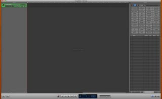
This is garageband. We used this to edit the
soundtrack of our opening. We trimmed the
bits we didnt want and then put it all back
together again. We also made our practice
soundtrack on this.
Evaluation Actvity 7
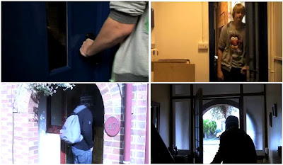
These are a few screengrabs from my opening and my prelimanary task. This is to show what we included in the film that we learnt in our prelimanary task. We focused on the match on action shot which is where a shot switches to another but there both of the same thing. For example someone opening the door, then switches to a shot of him coming out of the door. We also thought about using the 180 degree shot, but as there is only one character we didn't include it.
Monday, 16 November 2009

We believe that our film best suits the BBFC rating of 12A. The reason for this is that we think the dark tone and the idea of running away from home may be a bit to serious for a PG audience. Also the use of bad language, and scenes of bullying is not suitable for a younger audience. We also think that the age group best suits the genre and story as the audience can relate to it.
Tuesday, 10 November 2009
Saturday, 31 October 2009
Our Feedback
Strengths:
- The music worked really well.
- There are a few shots that are effective
Things To Be Worked On:
- Titles
- A wider variety of shots and angles
- Make the argument clearer
This gives me a good idea on what we need to work on, and it shouldnt be too hard to fix.
- The music worked really well.
- There are a few shots that are effective
Things To Be Worked On:
- Titles
- A wider variety of shots and angles
- Make the argument clearer
This gives me a good idea on what we need to work on, and it shouldnt be too hard to fix.
Feedback For Hannah & Emma
L3 - GROUP 2 (Hannah & Emma) Film Opening Rough Cut from cmdiploma on Vimeo.
I thought this was a good opening, but there is some little tweaks to be made, which the group probably know. But a lot of strengths
Strengths:
- I thought the music went really well with the characters, because the lyrics can connect to them.
- There is a wide variety of shots, and angles. I particually liked the shot when the camera zooms in the mirror, and zooms back out. This shows the two characters well, and gives a very teen feel.
- I like that they added some humour by overdoing the geek, and the shot with the tipex and nail polish.
Things to work on:
- Titles
- In a few shots i could still hear some backround noise, i dont know if this was intentional, but it may be worth a look.
- A few of the shots are too shaky, but most work well.
- There is a gap between clips, but i believe this is going to be filled in.
Over all i think the group have done very well, and theres only a few things they need to work on. Well Done ! XD
Monday, 19 October 2009
Sunday, 18 October 2009
http://www.youtube.com/watch?v=AmCtU1C3dcc
I thought his opening of tenacious D is the most similar opening to ours. Mostly because its about the young boy who runs away from his home, beacause his family dissaprove him playing rock music. A similar story line to ours.
I thought his opening of tenacious D is the most similar opening to ours. Mostly because its about the young boy who runs away from his home, beacause his family dissaprove him playing rock music. A similar story line to ours.
first draft
we have done all the filming for our draft. We filmed the first part in tom B house, and then mill road, cycle bridge, and parkers piece. we have done some but still have some editing to do. We have put all the clips in the right order, and timings (there may be some tweaks). We still need to add the titles, and music.
Tuesday, 13 October 2009
Sunday, 11 October 2009
Mine and Svens prelimary task
This is the prelimary task that me,sven,christina, and charna filmed. The aim of the task was to get several different shots like long shot then close up then over shoulder shot etc. Basically looking like we had several differnt cameras at one time. Me and Sven then went on to editing this in final cut express.
L3 LIAM (A Pure Genius Productions) IDENT from cmdiploma on Vimeo.
This is my final productions ident. I got several different images, and put the together in photoshop. Then I put that into final cut express, and animated it. I used fades and key frames in order to get it how i wanted. I went into garageband and picked out some sounds that worked well with my ident, I finally added it to my ident clip and it was done.
animatic
L3 Group 3: TOM B & LIAM - OPENING SEQUENCE ANIMATIC from cmdiploma on Vimeo.
This is mine and Tom B's animatic storyboard. We took pictures of the postic storyboard we drew, and made them into a movie on final cut. We have no sound at the start of the clip and that is because we want natural sounds then. the music starts on the shot of the hand pressing the ipod. We added the title just after that because we thought it would work better than putting it at the end. If we did, it would look more like a trailer.
Tuesday, 6 October 2009
Monday, 5 October 2009
Sunday, 4 October 2009
Pitches
A mainstream action film that will appeal to 15-25yr old males:
A man gets attacked by muggers, and put in a comba. When he wakes up, he is alone and multiple events happen where he fights for his life
A supernatural thriller that will appeal to female audiences:
A teenage girl discoveres a cave near the house shes just moved to, and sees a little girl ghost who starts to control the girls actions.
An independent movie featuring a young protagonist:
A story about a young boy that moves from england to india without his family , and how he still gets up to mischief.
An animated feature to appeal to adult audiences:
The main character has trained to be a ninja, and fights gangs, gets taken hostage but manages to fight his way free
Friday, 2 October 2009
our cast
A Pure Genius Productions & Bad Monkey Productions
A Long Road Film
Cast -Nick Robinson,Marshall Kerry, James hickman
Costume designer- Harriet Nickels
Art Direction - Simon Green
Production Design - Michell Ford
Casting - Liam Togher, and Tom Bailey
Film Editing - Albert tuesday
Cinematography - Bill Thompson
Original Music - Lee Fai
Produced - Bert simons
Directed - Bert redman
Main Title
Monday, 28 September 2009
Feedback
You need to do a LOT more writing, answering the questions set and analysing what is there. Just having the video clips is not enough.
Sunday, 27 September 2009
CASE STUDY OF A FILM OPENING
This opening scene gives nothing away about the film, but it gives a feel of mystery and tension which would intrique the viewers. It names all the cast and crew with the most important role in the film. This could be quite boring the viewer and may lose interest. Titles appear in this order, the most important roles are shown first.
Arnold Scharzenegger
Michael Biehn
Linda Hamilton
Lance Henriksen
Paul Winfield - Lt. Traxler
Rick Rossovich, Bess Motta, Earl Boen
Mark Goldblatt-Editor
Adam Greenberg-Director Of Photography
Brad Fiedel-Music
Stanzi Stokes-Casting
Bruce M. Kerner-Executive In Charge Of Production
Stan Winston-Special Terminator Effects
Fantasy II-Special Visual Effects
James Cameron with Gale Anne Hurd-Writers
Johm Daly and Derek Gibson-Executive producers
Gale Anne Hurd-Producer
James Cameron-Director
We filmed the opening sequence of Juno. The first thing we had to do was planning. For this we drew a storyboard, wrote a list of all the camera shots, and camera angles. Also the props we would be needing. Then we went out and shot our footage, and we could only film on the coleridge site. It was quite difficult finding a place suitable for some shots. Then on tuesday me and sophie edited the shots we had in Final Cut Express. We have never used it before so i think we did pretty well. I learnt some good editing skills such as getting rid of audio from the clips we filmed. We didnt have enough time to add titles, but I have learnt how to. Overall i think we did a good job of the of the editing, and although we didnt get some shots the film looks pretty good.
Monday, 21 September 2009
Feedback
Good points on the two film openings, though I think you can go a bit further in what you say about them. For the post on Shifty, you need to say more about how the moodboard task worked and how it was based on a particular scene and trying to give a sense of atmosphere from that. Later you will be creating moodboards for your own project ideas.
This blog will be the evidence of your research and planning for the AS coursework, so there needs to be lots on it and lots of detail to it.
Pete
This blog will be the evidence of your research and planning for the AS coursework, so there needs to be lots on it and lots of detail to it.
Pete
Sunday, 20 September 2009
I have also looked at some as meia students film openings. I found this one that i really liked. I liked the way the titles were placed to match the shape of the backround, and i also liked the different camera positions of one scene making it look like they had multiple cameras filming. I found the whole opening alongside the music contiously built up the tension. The negative thing i found about this openeing is it was more like a trailer.
I have watched the opening scenes to 'the lord of the rings', 'casino royale' and 'visioneers'. My favourite was 'casino royale'. I chose this one because it made me want to watch more. It starts of with an action scene immediately, which made me intersted. By not knowing why there is the chase, i wanted to keep watching to find out. I think one of the most effective shots is the extreme long shot when there are on the cranes. This shows the surroundings and further shows their high up and there is danger.
Thursday, 17 September 2009
Postcard
 This is the postcard i made on photoshop by combining several images into one. I used different tools and techniques such as curves and glowing edges. I used the skyscraper as my backround and used curves to make the colours more interesting. I added a film strip and effected it with glowing edges, and rotated it slightly. I added creative media text and put media down the skyscraper. Finally i added the long road logo. I have learnt many different ways of doing things, and some basic editing.
Wednesday, 16 September 2009
Final Cut Express
In tuesdays lesson i learnt the basic skills of final cut express. I learnt how to put music and video clips into it, how to cut them down, and putting transitions between clips. I also learnt how to put titles to the clips, and make them move around the screen.
Tuesday, 15 September 2009
Saturday, 5 September 2009
Subscribe to:
Comments (Atom)


